Jon Atkinson23/07/21
8 min read

The word accessibility is now commonly used in website design, but it isn’t always truly understood - and that could have major implications. Significant accessibility barriers exist across the online space; surprisingly, more than in the offline world.
Alarmingly, the Radical Accessibility Report shows that online support from charities presented barriers to 40% of disabled people.
The report goes on to say that only 51% of charities have accessibility procedures built into their websites and it states:

While time and resource obviously plays a part, much of it comes down to not knowing what the needs of service users are in a digital context, and then how to cater for these needs.


It is why conducting audience research and creating digital personas is so important in your organisation.
Accessibility for digital products - including apps as well as websites - covers a number of areas and goes beyond increasing font size or ensuring content works across all devices.
The UK’s Equality Act 2010 states that you are legally required to make reasonable adjustments for disabled people when they’re needed and while charities may be exempt from defined regulations, ignoring accessibility requirements just doesn’t seem logical.
And remember, even if you are having a website developed externally, you are legally responsible for it so it’s highly recommended to make accessibility a priority within your RFP or briefing document.
The World Wide Web Consortium (W3C) provides a full set of accessibility guidelines, but they are a little impenetrable so we have attempted to make them more, shall we say, accessible.
In this article, we’ll take a look at some of the most common elements of a website and what you should be considering in order to comply with accessibility rules.

Before the actual coding phase of a website, a critical step is to create wireframes which map out its structure.
Wireframes demonstrate the elements of key pages and how they will be ordered. Think of them as blueprints for your website pages.
Just as you wouldn’t head straight into laying bricks when building a house, so you shouldn’t move directly into designing your website without an agreed structure.
The order - and consistency - of web pages needs to make sense for the purposes of accessibility because technology, such as screen readers, rely on this when presenting content to users.
The wireframes stage also allows you to clearly mark-up what accessibility features will be included in the design and why they’re there.
What W3’s Web Content Accessibility Guidelines say
Information, structure, and relationships conveyed through presentation can be programmatically determined or are available in text.
When the sequence in which content is presented affects its meaning, a correct reading sequence can be programmatically determined.

When it comes to the size of your website text, there’s no need to make it any bigger in your design stage in order to make it easier for users with visual impairment.
However, what you must ensure is that the main text - everything except for captions and alt text for images - can be doubled in size, using magnification software, without it impacting how the website looks and works.
It’s generally good practice to ensure that the size of the text is sufficient for users, anyway; small text normally means poor user experience.
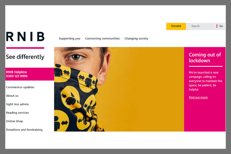
Take a look at the text size and spacing on the RNIB’s website: it’s a little different from ‘normal’ websites and clearly has taken into account that many of its users will be visually impaired.
Try to avoid what is called ‘images of text’ where possible. This is where a designer might have created a graphic full of text so it is saved in an image format, such as a jpeg.
While you can add alt text to this for screen readers, when such text is magnified it can lose resolution which could make it difficult to read.
The other main consideration with your text is that all headings and labels on your website describe the topic of the page or purpose of the label, button or action e.g. ‘Donate’.
What W3’s Web Content Accessibility Guidelines say
Except for captions and images of text, text can be resized without assistive technology up to 200 percent without loss of content or functionality; Headings and labels describe topic or purpose; If the technologies being used can achieve the visual presentation, text is used to convey information rather than images of text.
There are some specifics to be aware of when planning the layout of text on a web page.
Guidelines state that text should be what is called ragged i.e. not justified to both left and right margins, the leading of text is of a certain size and that it is clear when a new paragraph begins. This is created by using correct spacing sizes.
It is also important to ensure that when users double the size of text, that it remains readable on their screen without the need to scroll horizontally.
This all means that you want to avoid having large slabs of text and this should be achieved when creating your base page templates, which themselves should be created from wireframes.
The guidelines also state that users should be given the option of selecting both foreground and background colours on pages.
What W3’s Web Content Accessibility Guidelines say
For the visual presentation of blocks of text, a mechanism is available to achieve the following:
For each image across your website, you must ensure that it can be described in detail. Use alt text to achieve this.
For example, “Lucy the labrador rescue dog, who was housed in a London charity kennel, is photographed walking with her female owner in a field as the sun shines” is much better than simply saying “Lucy the labrador”, which you might feel is sufficient if the photo sits on an article page which tells her story.
What W3’s Web Content Accessibility Guidelines say
All non-text content that is presented to the user has a text alternative that serves the equivalent purpose.
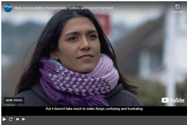
Most modern websites will contain videos in some shape and you’ll need to provide text alternatives for these. The most common methods are to create captions or to transcribe the videos in full.
Hosting videos on YouTube and then pulling them into your CMS is a recommended approach as you will be able to turn on captions from the platform and it also means that you won’t need to deal with hosting the videos yourself, something which could slow your site down.
For visually-impaired users, you should look to create an audio track, which can be done in a number of ways.
What W3’s Web Content Accessibility Guidelines say
For prerecorded audio-only and prerecorded video-only media, the following are true, except when the audio or video is a media alternative for text and is clearly labeled as such:
The world wide web is built on links - and your website will undoubtedly contain many of them, signposting users to internal categories and pages as well as to external resources.
You need to ensure that the purpose of each link can be clearly identified from the link text. This means avoiding using anchor text such as ‘click here’ and instead using descriptive text.
Below is the Cancer Research website, with fully descriptive text for the links in pink.
What W3’s Web Content Accessibility Guidelines say
A mechanism is available to allow the purpose of each link to be identified from link text alone, except where the purpose of the link would be ambiguous to users in general.
Similar to links, buttons or actions on your website should be clearly labelled. You can see a good example of this below.
What W3’s Web Content Accessibility Guidelines say
If non-text content is a control or accepts user input, then it has a name that describes its purpose.
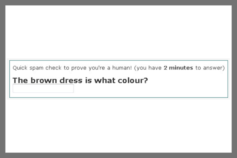
This mechanism to prevent hackers and bots from spamming forms, comments sections and more has become widespread and if your website uses this technology you need to ensure relevant alternatives are in place.
For example, if your captchas are based on images you must provide a text alternative.
Examples of accessible captchas can be found on the Vision Australia website. Here’s just one:
What W3’s Web Content Accessibility Guidelines say
If the purpose of non-text content is to confirm that content is being accessed by a person rather than a computer, then text alternatives that identify and describe the purpose of the non-text content are provided, and alternative forms of CAPTCHA using output modes for different types of sensory perception are provided to accommodate different disabilities.
An area of accessibility which is commonly overlooked is that of the use of colours and how they conflict and contrast.
Around 1 in 12 men and 1 in 200 women have some degree of colour vision deficiency. Often we refer to people as being colour blind but, in fact, this is extremely rare.
Experiencing difficulties in distinguishing shades or some colours is way more common, which is why getting colour contrast right on your website is so important.
Anything which is indicated by colour must have a secondary way for it to be identified - and this is applicable to everyone, of all ages using different types of devices.
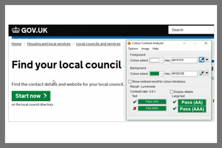
The Government website contains good and bad examples of colour contrast - the bad using a combination of orange and white and the good using a combination of green and white.
The analysis is based on the colour contrast ratio and tools are available to determine this, including the TPGi contract checker.
What W3’s Web Content Accessibility Guidelines say:
The visual presentation of text and images of text has a contrast ratio of at least 4.5:1.
Resources
The web contains a few tools which can help you conduct accessibility audits to determine the areas you need to work on. They include:
https://www.tpgi.com/free-website-accessibility-scan/
Charities need to keep up with their online accessibility provision - but that’s not easy when you don’t know what the rules are.
The W3 Content Accessibility Guidelines, while providing deep levels of detail, also provide this handy at-a-glance checklist which should help you.
It states that your website needs to be:
Perceivable
Operable
Understandable
Robust
As more and more people turn to their laptops, smartphones and screen readers, you need to ensure your website serves them how they need to use it.
Share this:


Jon Atkinson
CTO at Giant Digital
Jon heads up the development team as Technical Director and founding partner at Giant Digital. With over 20 years as a Python developer, he has the perfect balance of hands-on experience and strategic expertise when it comes to developing innovative and technically sound solutions for charities. He fully understands the importance of user-driven design to create engaging and effective platforms that deliver real impact.